Case Study: Dona Pharmacy
Turning a Pharmacy Website into a Skincare Consultation Entry Point
Turning a Pharmacy Website into a Skincare Consultation Entry Point
Dona Pharmacy is a local pharmacy brand with three physical locations, known for its skincare expertise and the ability to create custom-made skincare products based on individual skin analysis: a strong differentiator that was not reflected in their existing website experience
Dona Pharmacy is a local pharmacy brand with three physical locations, known for its skincare expertise and the ability to create custom-made skincare products based on individual skin analysis: a strong differentiator that was not reflected in their existing website experience
Dona Pharmacy is a local pharmacy brand with three physical locations, known for its skincare expertise and the ability to create custom-made skincare products based on individual skin analysis: a strong differentiator that was not reflected in their existing website experience
Industry
Industry
Pharmacy
Pharmacy
Pharmacy
Pharmacy
Pharmacy
Healthcare
Healthcare
Primary Goal
Primary Goal
Conversion
Conversion
Conversion
Conversion
Conversion
Plus Email Subscription
Plus Email Subscription
Audience
Audience
Women 20-40y
Women 20-40y
Women 20-40y
Women 20-40y
Women 20-40y
Skincare & Dermatology
Skincare & Dermatology
I explored how a conversion-focused homepage redesign could better reflect Dona Pharmacy’s skincare expertise, especially their online skin analysis. The goal was to guide visitors toward clearer next steps: start an analysis, shop best-sellers, or subscribe for ongoing advice.
The Problem
The Problem
Despite having a valuable service offering, the original website failed to communicate it effectively
Despite having a valuable service offering, the original website failed to communicate it effectively
Key UX & Conversion Issues Identified
Key UX & Conversion Issues Identified
The main USP (personalized skincare via online analysis) was hidden inside the navigation
The homepage lacked a clear primary call to action
The hero section did not explain what makes the pharmacy different
Navigation was cluttered and unclear
No visible social proof or authority signals above the fold
Products were accessible only via categories, adding unnecessary friction
The website felt outdated and underutilized the full screen, reducing perceived trust
As a result, users were required to explore and infer value themselves, which is risky in a healthcare context where clarity and trust are critical.
My Contribution
My Contribution
Identified conversion blockers in the old homepage
Elevated skin analysis as the main action
Rebuilt messaging, trust signals, and product discovery
Refreshed the visual identity (type + colors)
This project was executed as a self-initiated redesign to explore how UX and messaging changes alone can unlock hidden value in a healthcare brand

Diagnosis & Hypothesis
Diagnosis & Hypothesis
The homepage behaved like a product catalog, while users were arriving with a need for guidance and reassurance
If the homepage clearly:
communicates the pharmacy’s expertise,
surfaces the online skin analysis as the main action,
and reduces friction to both advice and product discovery,
then users would be more likely to:
engage with the skin analysis,
trust the brand,
and convert or subscribe.
Redesign Goals
Redesign Goals
Primary goals
Make the online skin analysis impossible to miss
Establish authority and trust immediately
Guide users toward a clear first action
Reduce cognitive load and decision fatigue
Secondary goals
Improve perceived professionalism of the brand
Increase time on site
Support both advice-seeking and purchase-oriented users
Strategy
Strategy
Reposition the homepage from a generic pharmacy site into a conversion-focused skincare consultation entry point.
Clarity over completeness
One primary action above the fold
Expertise before persuasion
Reduce friction, don’t add options
Guide scanning behavior intentionally
Reposition the homepage from a generic pharmacy site into a conversion-focused skincare consultation entry point.
Clarity over completeness
One primary action above the fold
Expertise before persuasion
Reduce friction, don’t add options
Guide scanning behavior intentionally


Before the Redesign
Before the Redesign
Key screens from the original Dona Pharmacy homepage


Key Design Decisions
Key Design Decisions
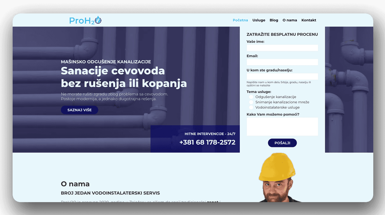
Hero Section
Hero Section
Before:
Overloaded navigation competing with content.
After:
Supporting Google review placed directly below the CTA
Visual reinforcement showing a pharmacist creating a custom product
Supporting Google review placed directly below the CTA
Visual reinforcement showing a pharmacist creating a custom product
Supporting Google review placed directly below the CTA
Visual reinforcement showing a pharmacist creating a custom product
Supporting Google review placed directly below the CTA
Visual reinforcement showing a pharmacist creating a custom product
Supporting Google review placed directly below the CTA
Visual reinforcement showing a pharmacist creating a custom product
Why?
Most users scan above the fold. If the value isn’t immediately clear, they leave. The hero now answers review placed directly below the CTA
Most users scan above the fold. If the value isn’t immediately clear, they leave. The hero now answers review placed directly below the CTA
Lead magnet: Online Skin Analysis
Lead magnet: Online Skin Analysis
Before:
After:
Elevated as the primary conversion action
Repeated across the page
Introduced with clear educational copy explaining its scientific value
Implemented as a popup flow to support a multi-step process (photos, questions, etc.)
Elevated as the primary conversion action
Repeated across the page
Introduced with clear educational copy explaining its scientific value
Implemented as a popup flow to support a multi-step process (photos, questions, etc.)
Why?
This is the pharmacy’s strongest differentiator. Surfacing it increases perceived value and shifts the relationship from “shop” to “expert guidance.”
This is the pharmacy’s strongest differentiator. Surfacing it increases perceived value and shifts the relationship from “shop” to “expert guidance.”
Product Presentation
Product Presentation
Before:
After:
Most popular products surfaced directly on the homepage
Clear “Add to cart” CTAs
Categories retained as secondary navigation
Most popular products surfaced directly on the homepage
Clear “Add to cart” CTAs
Categories retained as secondary navigation
Why?
Users who already trust the brand should be able to act immediately, while exploratory users still have structure.
Users who already trust the brand should be able to act immediately, while exploratory users still have structure.
Trust and Credibility
Trust and Credibility
Added:
Emphasis on scientific and professional language
Emphasis on scientific and professional language
Why?
Healthcare decisions require reassurance. Trust signals were intentionally placed near decision points, not buried at the bottom.
Healthcare decisions require reassurance. Trust signals were intentionally placed near decision points, not buried at the bottom.
Navigation and Structure
Navigation and Structure
Changed:
Clear separation between advice, analysis, and shopping
Clear separation between advice, analysis, and shopping
Why?
Navigation should support decisions, not distract from them.
Navigation should support decisions, not distract from them.
Reflection and Next Steps
Reflection and Next Steps
If this redesign were deployed in production, the next steps would include:
If this redesign were deployed in production, the next steps would include:
A/B testing hero copy
Simplifying the skin analysis form
Creating dedicated product detail pages
Tracking CTA interaction rates and form completion drop-offs
A/B testing hero copy
Simplifying the skin analysis form
Creating dedicated product detail pages
Tracking CTA interaction rates and form completion drop-offs
Why This Case Study Matters
Why This Case Study Matters
This project demonstrates my ability to:
I'm open to business!
I'm open to business!
If you’re serious about growing your business and ready to lay the digital groundwork that scales, let’s talk:
Website Design & Development
I can build you a custom website that converts the website visitors to customers.